Microsoft Is Rolling Back Windows 11 — One Feature at a Time
The Windows 11 26H2 preview reveals Microsoft retracting some of the most criticized UI changes from the original release — a context menu that lets users choose a Windows 10-style layout, a simplified Start Menu, and fewer forced restarts. The shift signals a recalibration after years of frustrated enterprise users.
Microsoft Is Unlearning Its Own Design Decisions
The first Windows 11 26H2 preview dropped into the Release Preview channel on August 27, and what stands out most is not the new features — it is the concessions.
Windows 11 launched in 2021 with a radical reimagining of the desktop experience: centered Start Menu, simplified context menus, a restructured taskbar. Six years later, Microsoft is quietly retracting several of those changes for power users who simply want their workflows back. The 26H2 preview is less a statement of where Windows is heading than a repair job on where it wandered off track.
The Context Menu That Remembers Windows 10
The most telling change involves the right-click context menu — one of the most complained-about redesigns in recent Windows history.
In Windows 11, Microsoft moved the Properties option into the middle of the menu, replaced traditional text entries with icon-driven primary actions at the top, and generally flattened the hierarchy that power users had internalized over decades. The result was slower workflows and a persistent sense of friction in everyday tasks.
26H2 introduces an option to revert toward the Windows 10 layout: Properties returns to the bottom row, the icon-heavy primary action entries become plain menu items, and the overall structure more closely resembles the classic experience. Microsoft is not calling this a rollback — it is framing it as a customization choice. But functionally, it is an acknowledgment that the original design lost users.
The Taskbar Moves — But Not Where You Might Expect
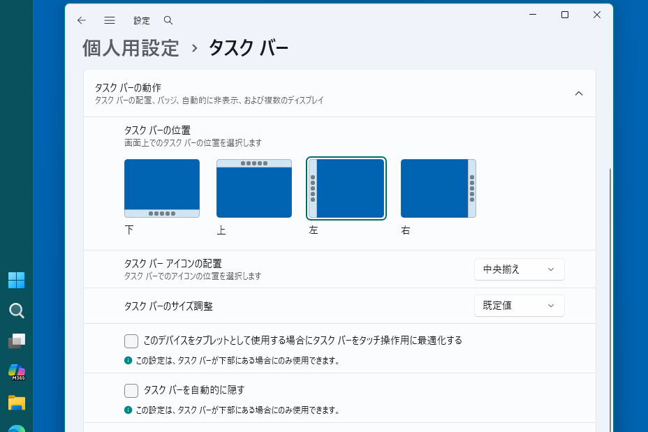
Taskbar positioning has also received attention. For the first time since Windows 11 shipped, users can place the taskbar on any screen edge — top, bottom, left, or right — through Settings. Size adjustments are available in two increments.
The catch is that you can no longer drag the taskbar directly on screen as you could in Windows 10. The setting-driven approach is slower and less intuitive. More significantly for enterprise users with multi-monitor setups, per-monitor taskbar positioning is gone. In Windows 10, you could place the taskbar on the top edge of an upper monitor in a vertical dual-monitor arrangement to avoid it crossing the desktop. That capability does not exist in 26H2 yet, and there is no indication it is planned for this release.
For the average single-monitor user, this is fine. For enterprise environments with complex display configurations, it is another data point in a long series of “Windows 10 could do this, Windows 11 cannot.”
Restart Fatigue Gets a Partial Fix
Windows Update in 26H2 includes a meaningful change to how monthly cumulative B updates handle reboots. The key shift: update restarts are now batched into a single scheduled window rather than triggered piecemeal as each individual update completes.
Previously, if multiple updates arrived and each required a restart, users could face consecutive reboot notifications within hours. The new approach consolidates these into roughly one restart per month, aligning with how enterprise IT teams already plan maintenance windows.
There is also a 35-day update pause option, allowing users to defer updates for extended periods — useful for environments running critical workloads that cannot tolerate mid-cycle interruptions.
This is not a radical change, but it addresses one of the most common complaints about Windows 11’s update behavior, which felt aggressive and unpredictable compared to the more measured pacing of Windows 10.
The Start Menu Gets Trimmed
The Start Menu in 26H2 can now be configured to show only pinned applications, stripping away the recommended items, history suggestions, and other content that many users found distracting. Size options are available in large and small, with an automatic mode that selects based on display resolution.
This is Microsoft responding to feedback that the Start Menu had become cluttered — particularly in enterprise deployments where IT teams prefer lean, predictable interfaces over curated content recommendations.
WSL Containers Arrive (Eventually)
Windows Subsystem for Linux is gaining container support in 26H2. The feature will ship as a preview at release and is expected to reach general availability sometime during the 26H2 lifecycle. For developers and DevOps teams, this narrows the gap between WSL and full Docker or Kubernetes tooling on Windows — a competitive advantage over Linux-native environments that has historically been a sticking point for enterprise adoption.
Windows Search Gets Smarter and Simpler
The search window accessed from the taskbar has been stripped of its right-side image preview pane, producing a cleaner, more focused interface. More practically, the search function now tolerates partial input — typing “utlook” will still find Outlook.
These are incremental improvements, but they matter in daily use. The fuzzy matching, in particular, reduces friction for users who are half-remembering what they are looking for.
What This Means for Enterprise
The cumulative effect of these changes is clear: Microsoft is correcting course after the rough launch of Windows 11. The context menu reversal, the simplified Start Menu, the batched restarts — these are all responses to real user frustration, not speculative design choices.
For enterprise IT teams, the implications are practical. The per-monitor taskbar limitation remains a gap for complex deployments. The WSL container preview is useful but not yet production-ready. The update restart improvements will reduce help desk tickets around forced reboots. And the ability to customize the Start Menu and context menu means fewer workarounds needed to make Windows 11 acceptable to users who resisted the original design.
The 26H2 preview does not signal a radically new direction for Windows. It signals a maturing product that has learned, through direct feedback, which of its early bold moves were missteps — and is now willing to undo them.